-
Architects: NaNA JOHNNY CO->STUDIO
- Area: 77 m²
- Year: 2021
-
Photographs:Kitti Vichai
-
Manufacturers: TOA, TYK Glass

Text description provided by the architects. GQ named their new generation of merchandise ‘SuperHero’. The 'individual' apparel category were manufactured with the thought of helping people through various 'innovations'. Our location is in the Siam area of Bangkok, Thailand. It is on the 2nd floor of the MBK building, an old shopping center that has been opened since the 1970s.


The area is 77 square meters and the shape is almost square, which is not huge at all compared to the products that the brand wants to display. The key challenge in this work is that the space must look wide and not cramped, must be able to present a large number of products, and with no wall in the middle of the space. The design must also be adaptable and it has to attract people in the mall's area. Additional information provided by the brand is that they needed 30-40% stock space on the site and 2 fitting rooms.


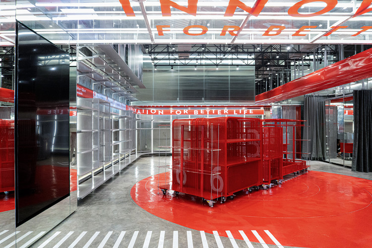
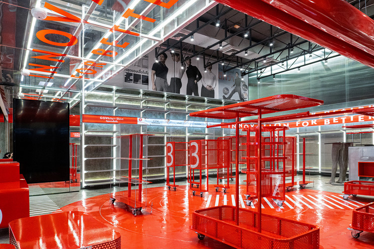
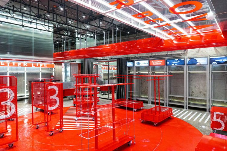
We first solved the problem of storage space and fitting rooms. We used the space on the 3 walls from 2400 mm up to the ceiling at 4400 mm as storage space and filled both sides with POP sliding panels that can be adjusted into many variations. In the back area, We installed the mezzanine floor that can be walked up to from the side of the checkout counter. It’s a steel structure attached to the original floor and finished with pattern glass to maintain the wall’s transparency while screening the stock from the outside area at the same time.


GQ agreed with us that the fitting rooms may only be used for certain periods, meaning that when it’s left unused, that space can't create value for the brand, also we want the store to look wider. Therefore, we chose not to build a fitting room at all, but to create a cabinet wall that can be used as stock by covering the front with 3 mirror panels and installing 2 sets of curtains. Using them as 2 fitting rooms in certain situations only. When not in use, the mirror will help expand the space of the shop.


The next step is to design the central area to be outstanding and unique with 3 keywords. 'Superhero' + 'Individual' + 'Innovation'. The products dubbed “SUPERHERO” are centered on a red circle-shaped floor painted with epoxy technique. The product is hung or folded on the fixtures that provide a different form according to each type of apparel. The variation can be adjusted according to the situation inside the shop such as promotional periods. The united fixtures, which we call GQ ROBO, can be assembled or disassembled to attract the people around the area in a seasonal promotion or disassembled up to the required proportion of sales during regular period. All of the requirements can be adjusted depending on the future demands of GQ.


